I-70 Winter Related Closure Analysis
An internship project analyzing large closure events on the I-70 Mountain Corridor.
April 30, 2026
Intro
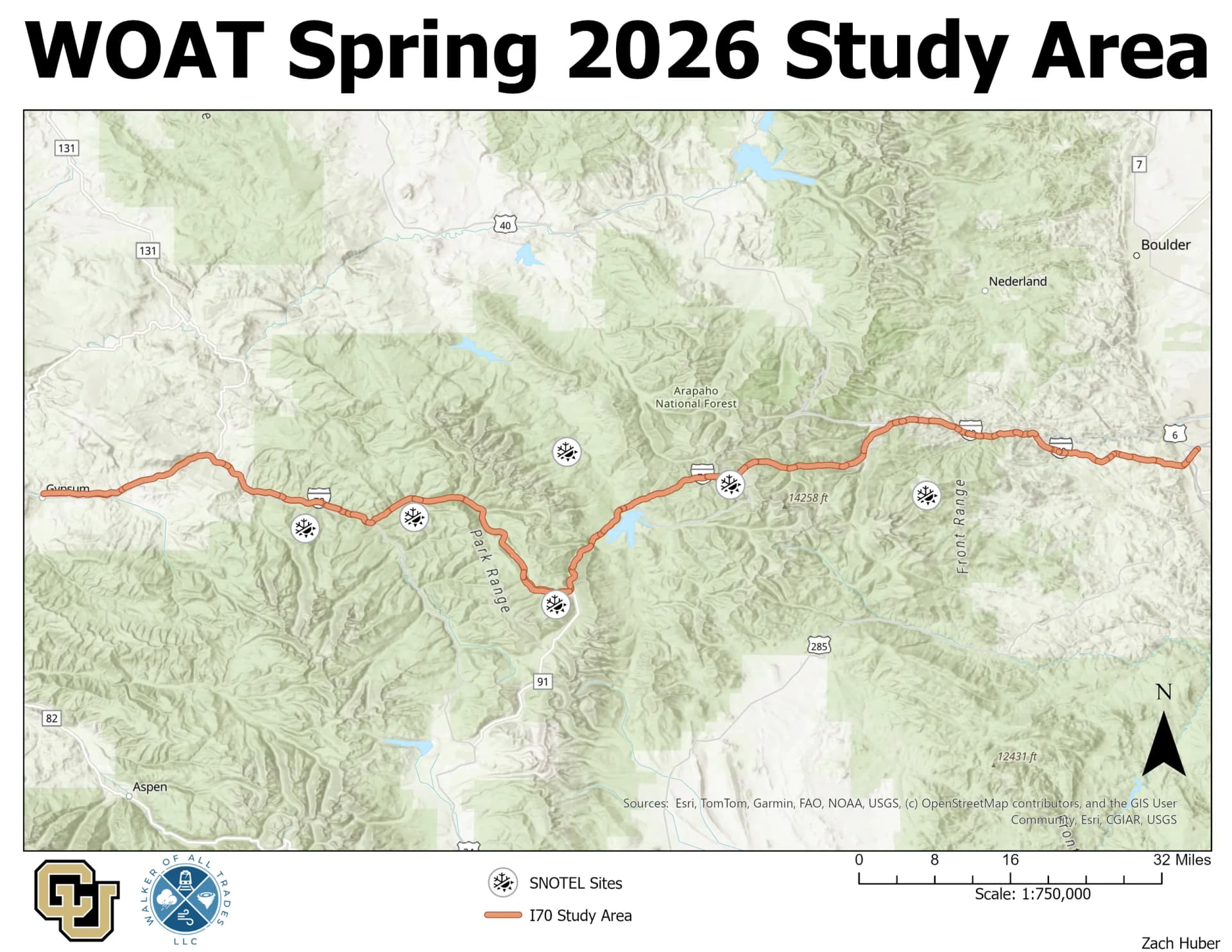
Over the course of the Spring 2026 semester, I did an internship for Walker of All Trades LLC. This project involved researching large weather related road closure events. We decided to look at primarily the I-70 Mountain Corridor, as it is a very important road that closes frequently due to weather. While a ton of different stuff was done for this project, it can be broken up into two main sections. Closure Analysis and Closure Visualization.
Analysis
The first part of this project involved large closure detection. The data I was working with was RITIS speed data. These data are given in either hourly or fivev minute temporal resolution. My task was to come up with a way to programatically detect large closure events. This was done using Python and other supporting libraries. The end result of this was a Python class that allowed me to parse the speed data, and identify closures. This only works for the spatial extent of the study (Golden to Gypsum).
Visualization
With the closure detection working, I had to come up with a way to visualize the closures. This brought me to one of the largest hurdles and frustrations in this project. While the RITIS speed data were accessable, shapefiles that could be used to visualize the speed data were not. The speed metedata gave a Latitude and Longitude for the start and stop of each segment, so I used that to create my own shapefiles. Each segment had a size that varied greatly, so just drawing a line between each point created a network of road lines that did not look great. Instead of going this route, I used a shapefile taken from CDOT for I-70. I then segmented that shapefile from based on each start and stop point from the speed data. From these segments, I was then able to do a join to make sure my segment IDs lined up with the speed data. This was all done using ArcGIS Pro, and some light Python scripting.
Now that I had speed data, closure data, and shapefiles corresponding to the speed data, I was able to start visualizations. For exploratory analysis, I used the ArcGIS Pro timeslider with my joined closure data and road segments. This allowed me to visualize how closures grew, and do some validation of my closure detection script. While this was useful for Analysis, I wanted to create something that the public could view (mostly to show off my coding skills).
Dashboard Development
To develope the dashboard, I decided to use the Mapbox GL mapping library. This library is very powerful for fast rendering which was perfect for the responsive visualization of speed and weather data. This library also has a very generous free tier, and is used by many large companies (Strava, Doordash, AllTrails). The frontend stack ended up being React, Vite, and Mapbox GL. I used React because I wanted to get more experience with what seems to be an industry standard frontend library/framework. The final result of this dashboard can be found here. Please play around with it and let me know if things break.